Contemporary Chic
National Kitchen and Bath Association's Best Medium Kitchen Award - 2019
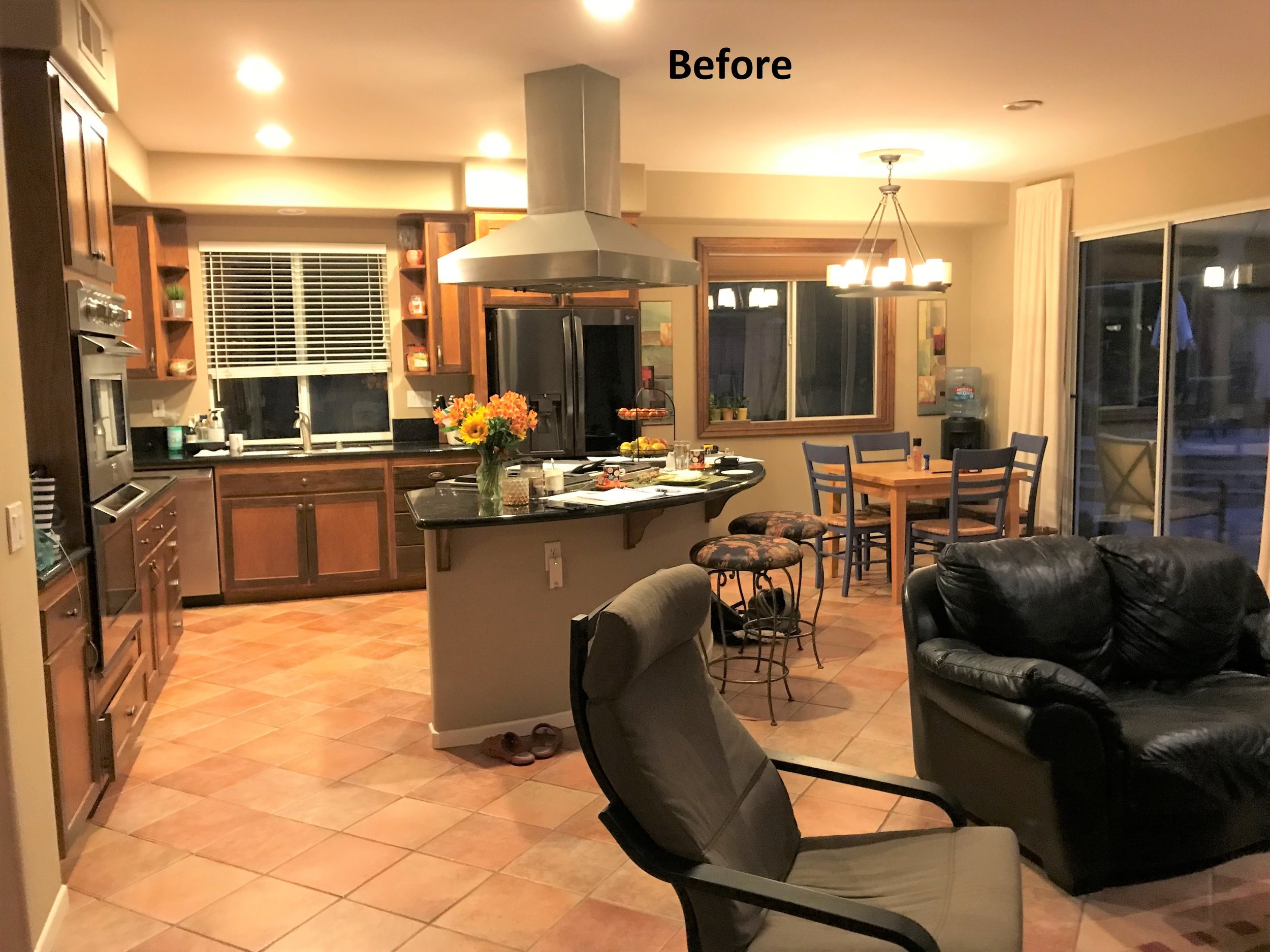
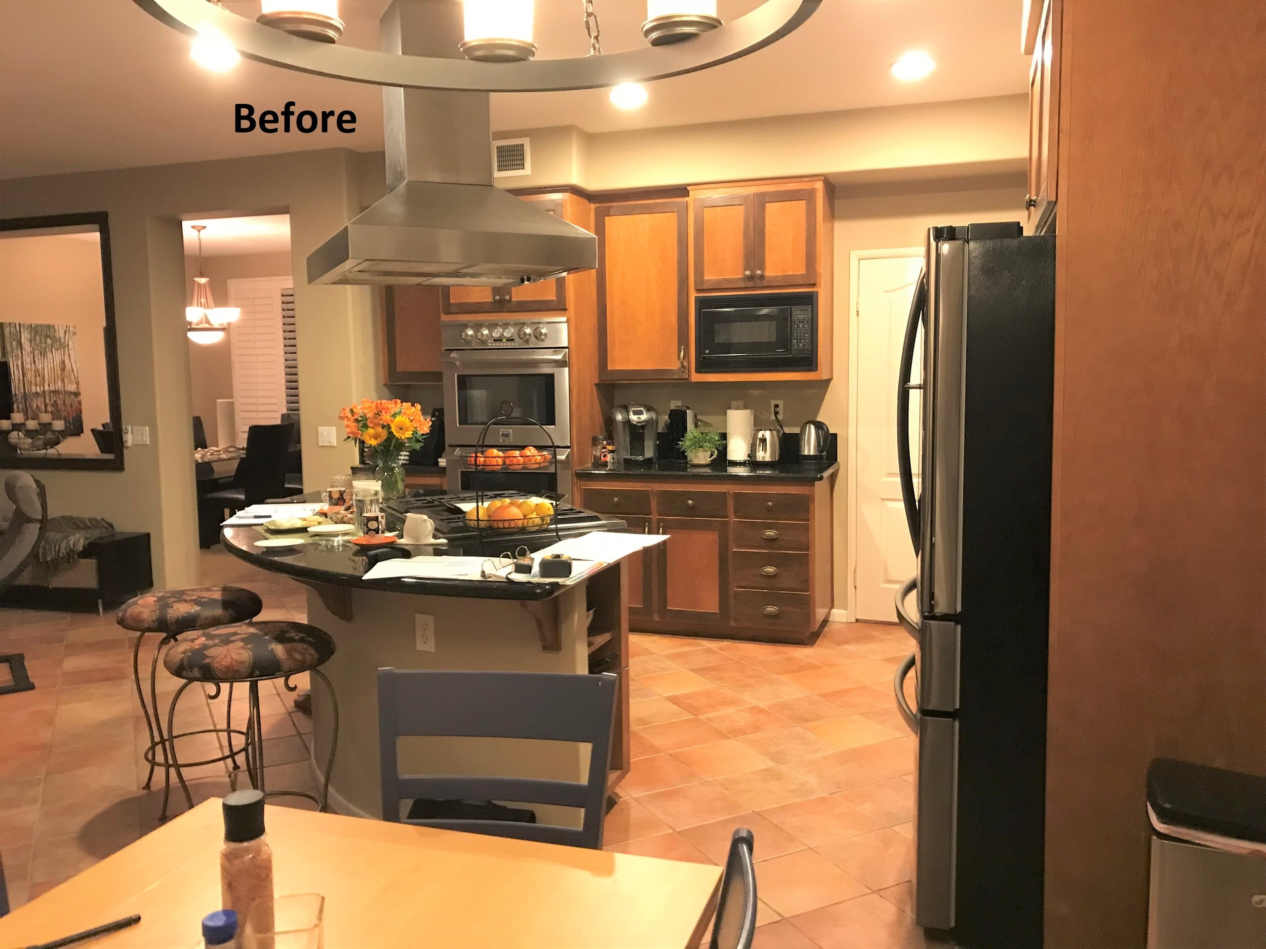
After a day’s work, the clients wanted to come home to a home that felt fresh, harmonious, and relaxing. They love a sleek, clean, modern look. High on their checklist was a low maintenance environment with quality products. Their home had a Mediterranean/country cottage feel in shades of brown, terracotta and black. The finishes were dated and didn’t feel as clean as they liked.
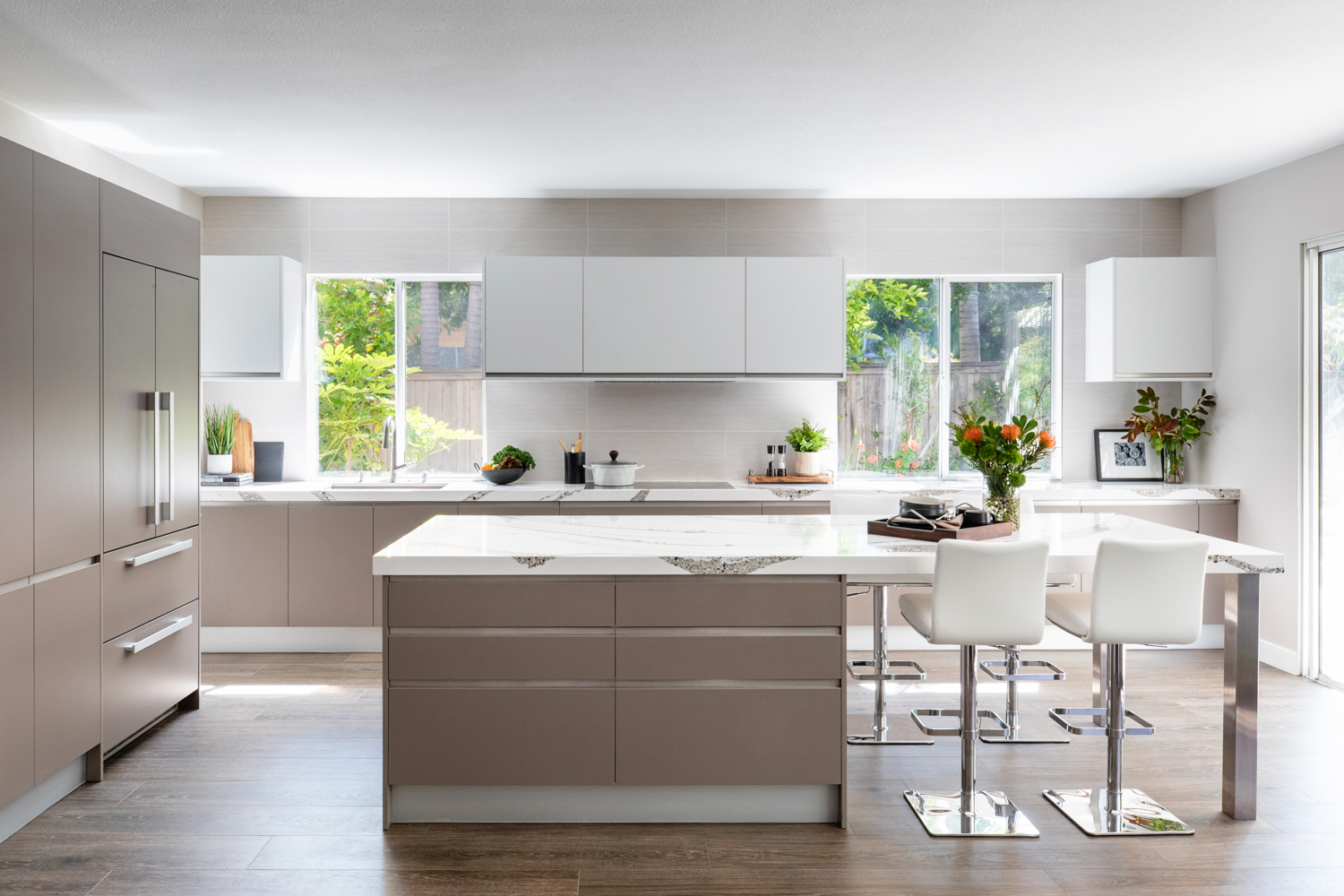
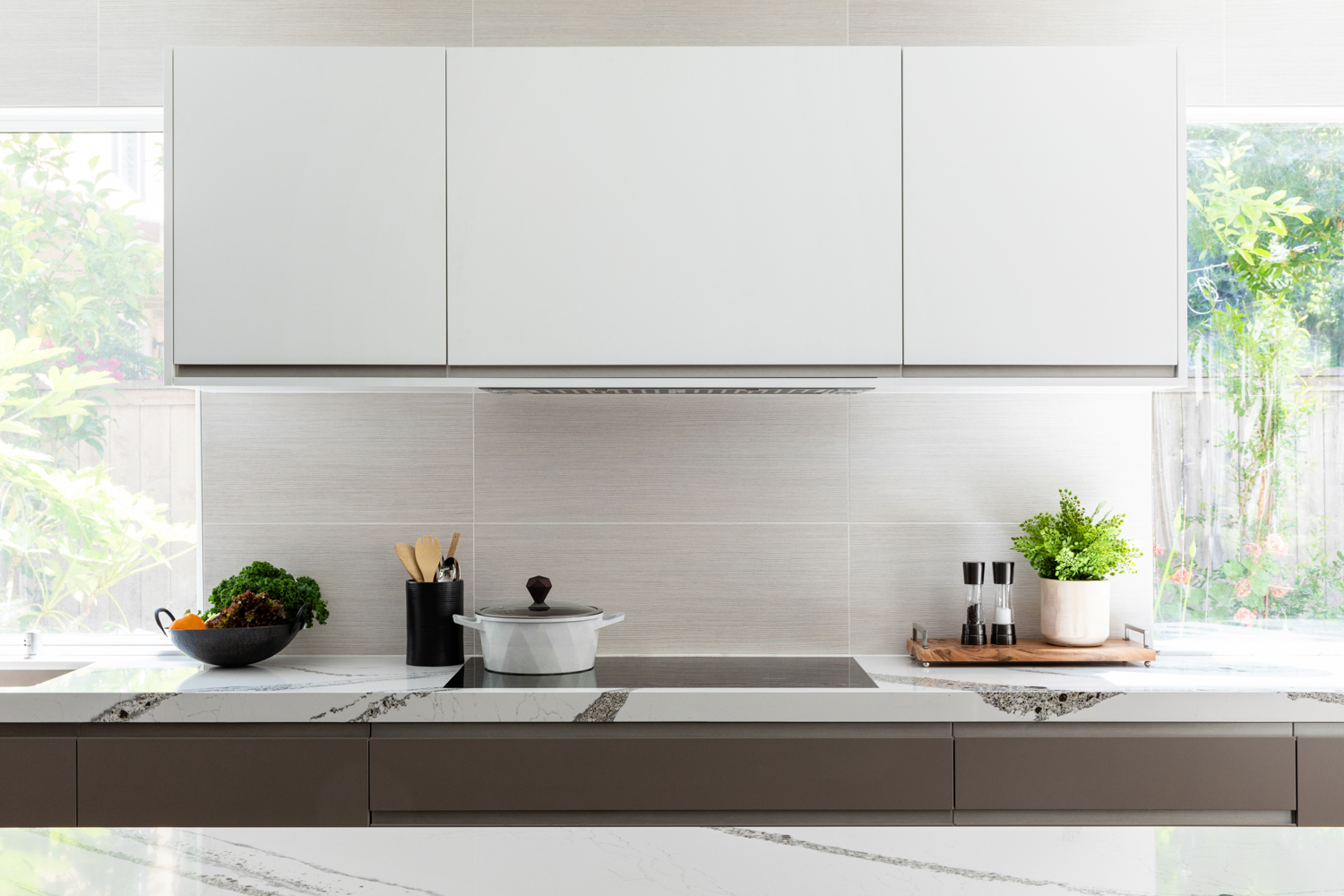
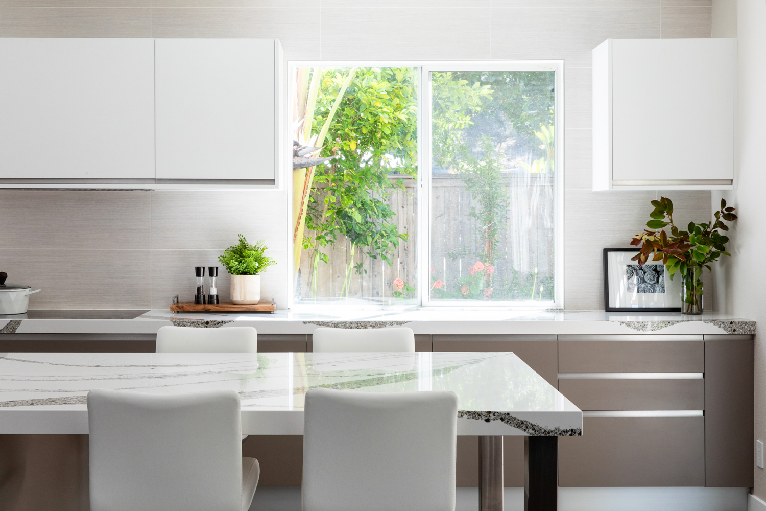
We began with the kitchen. It was essentially a pie shape tucked in the corner of the room which was dominated by a huge hood and a prominent refrigerator. The first step was to space plan so that all of the tall items were located on the least obvious wall of the room as you enter. The cook top and hood were relocated to the wall between the two existing windows to minimize their presence and to create balance. The cabinetry runs the entire length of this wall. This facilitates prep, cooking, cleanup, and plenty of storage. A long island contains additional storage on one end and an area to eat at the other. It is the perfect place to gather and entertain. This arrangement gave the kitchen improved functionality and felt more proportionate to the overall volume of the room.
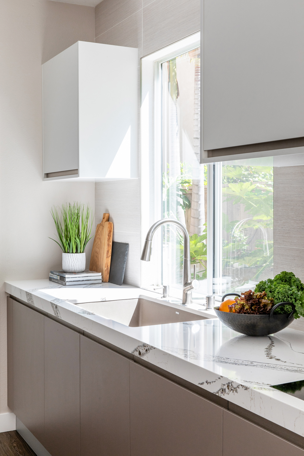
The European cabinetry features large drawers on the bottom where the homeowner can easily access items. The integrated appliances are hidden to enhance the clean, minimal look. Those appliances that can’t be hidden were chosen for their sleek appearance (and of course, their reputation for quality). The homeowners like wood floor but don’t care for the maintenance, so a wood-look plank tile in a rich grey/brown color was used.
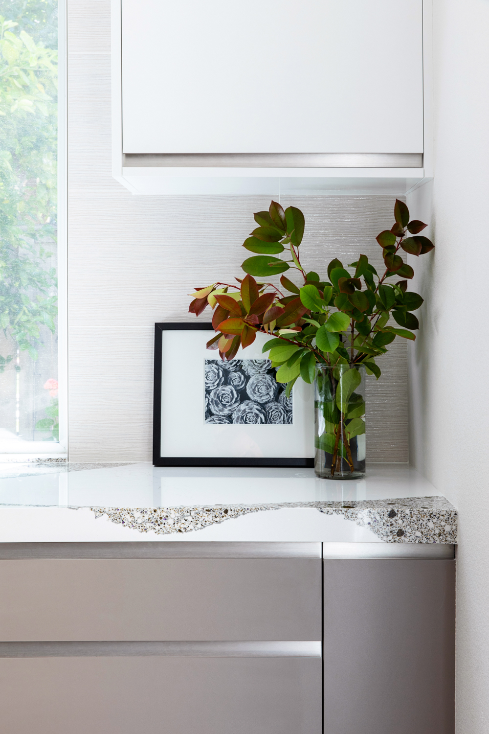
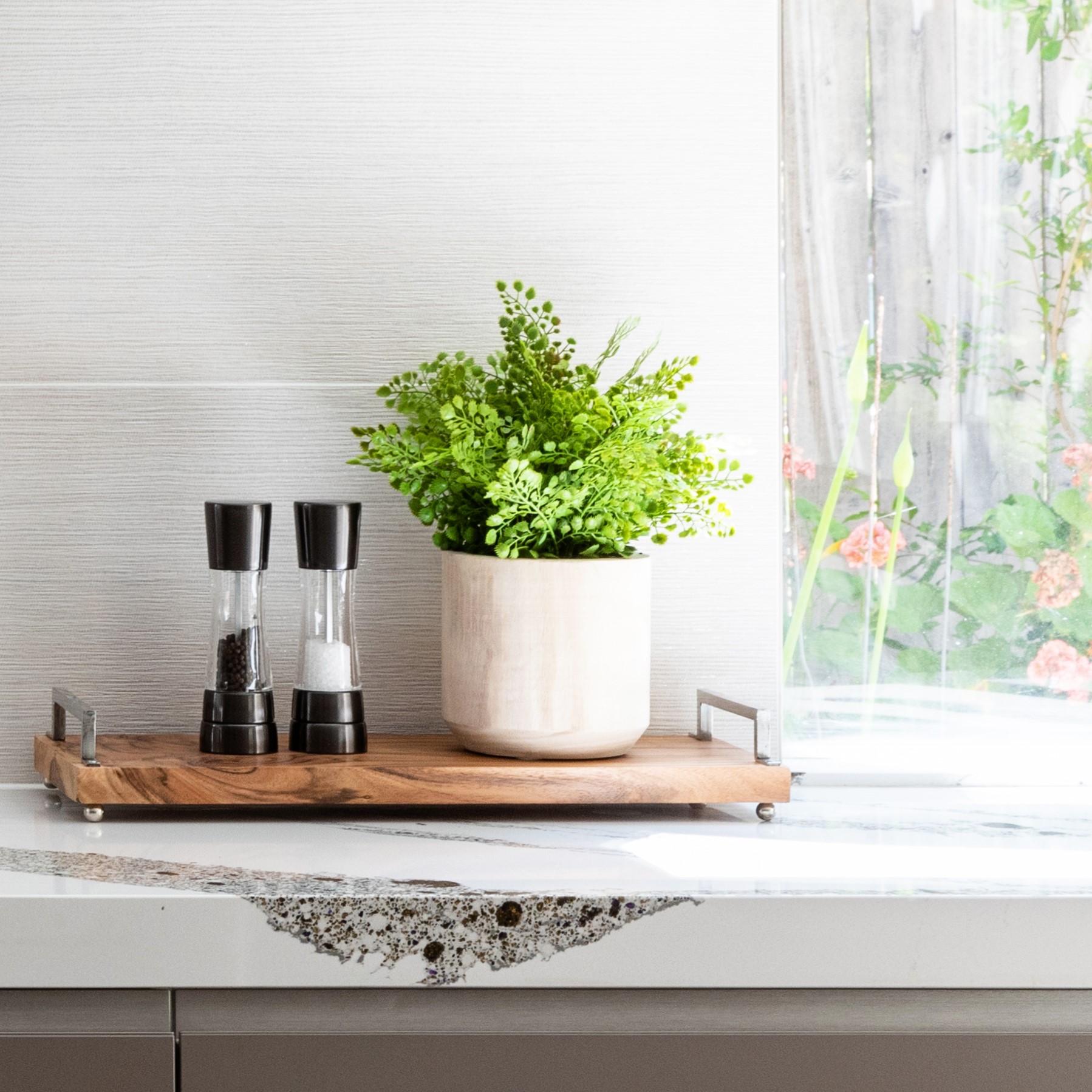
A soft warm truffle color was used on the lower and tall cabinets to anchor the arrangement. Crisp, white uppers and the windows on the cook top wall lighten the feel of the space. To balance out the earthy tones of the floor and the lower cabinets, a crisp, white, engineered counter top was used. The surface has a stream of truffle, gold and amethyst speckles flowing along its length like a wave. It is the subtle “wow” of the space. The large back splash tile also has hints of glimmer to compliment the counter top and create a bridge between it and the white upper cabinets.
The overall feel of the spaces are one of calm restraint and harmony. They feel fresh and modern, but yet has a warm, rich undertone. The layout is efficient and each resilient finish can be wiped clean with ease. All of the clients’ wish list boxes have been checked.
At the end of the day, it is the place that allows them to gather, refresh and rejuvenate with the minimal amount of effort.
